When the simplest solution is often the best one – the Mastercard rebrand
Us creative types can often overthink a design solution in an attempt to create something distinctive and beautiful, but one frequently finds the simplest solution can often be the best one. A great example of simplicity is the Mastercard rebrand in 2016 by Pentagram – the world’s largest independently-owned design studio. It is easy to overlook the most obvious solution perhaps because we don’t think it is creative enough or justifies the fees, but the trend these days is to have clear distinctive shapes and no gradients or drop shadows, so don’t overthink it. Pentagram is well known for this approach and has produced some fantastic brand identities over the years. Well done Pentagram, we love it!
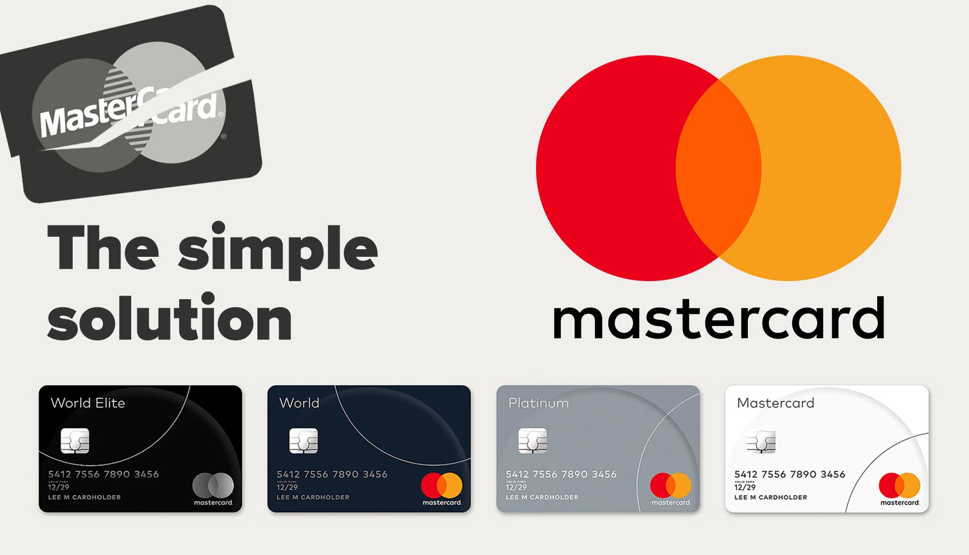
Mastercard is one of the world’s most instantly recognisable brands that is seen almost everywhere in our daily lives – on TV, billboards, bank machines and even in your wallet. Mastercard is used all over the world in many applications and at all sorts of sizes, so the solution needs to be flexible and recognisable in an instant. They also have the advantage of the massive brand equity gained over many years so they are already well known. To change the logo completely would have been the wrong thing to do and would have lost a lot of the brand equity. So it didn’t have any dramatic changes but rather some subtle ones to keep hold of the brand familiarity while optimising the brand for better use in today’s digital world.
In July 2016 Mastercard unveiled its biggest rebrand in 20 years and was a huge project that included a whopping 2.3 billion cards, all print communications, card machines/ATMs, websites, apps, head offices and advertising. One of the most obvious changes in the design was the move from two interlocking circles to two overlapping circles in yellow and red. The idea behind this was to create a feeling of ‘connectivity’ and ‘seamlessness’ in the brand which is part of Mastercard’s main ethos. The translucent orange centre gives a sense of ‘transparency’ from the brand while all the colours were brightened to make the brand feel more optimistic.
One of the less obvious changes was the font for the Mastercard name which was changed to FFMark. They also dropped the uppercase “M” and “C” and removed the word “MasterCard” from the circles. The new font isn’t just for the main branding but also for all print and communications from the logo down – this will be a big job for a company of this size to go through and implement the new brand identity.
So, after looking at the new Mastercard logo we can see that this new brand identity is more of a functional change for digital purposes rather than a fundamental design change – one of the designers said “I don’t think anyone’s seen the new logo and thought, ‘Wow, that’s clever’, I think they think ‘Isn’t that what it already looks like?’”.
The new design had mixed reviews across the design world with some saying that they love the new logo and others that weren’t too keen on the look and accused the design of being lazy. But three years on from that rebrand we can see it has been very successful.
A good logo is simple, memorable, and visually reflects the essence of a brand, making it instantly recognizable and timeless – see some of our examples here.