Why financial services design requires a different approach
Brand Management + Design for Print
Attention to detail and clarity of design were the most important requirements
Countrywide Assured plc don’t sell products – they take over existing policies from other companies to manage them as efficiently and robustly as possible. This was a crucial distinction to make, because they certainly didn’t want ‘marketing’ collateral with photos and graphics everywhere. Their objective has always been to communicate information about customers’ pensions, savings, life cover and critical illness policies via a range of simple to understand guides and leaflets.
Countrywide appointed Brandspace because we had a track record in financial services design and they knew our attention to detail was first class.
- Countrywide Assured
- Financial Services
- Brand, Print, Brochures, Guides
- countrywideassured.co.uk
Taking the stress out of text heavy documents at an emotional time for customers
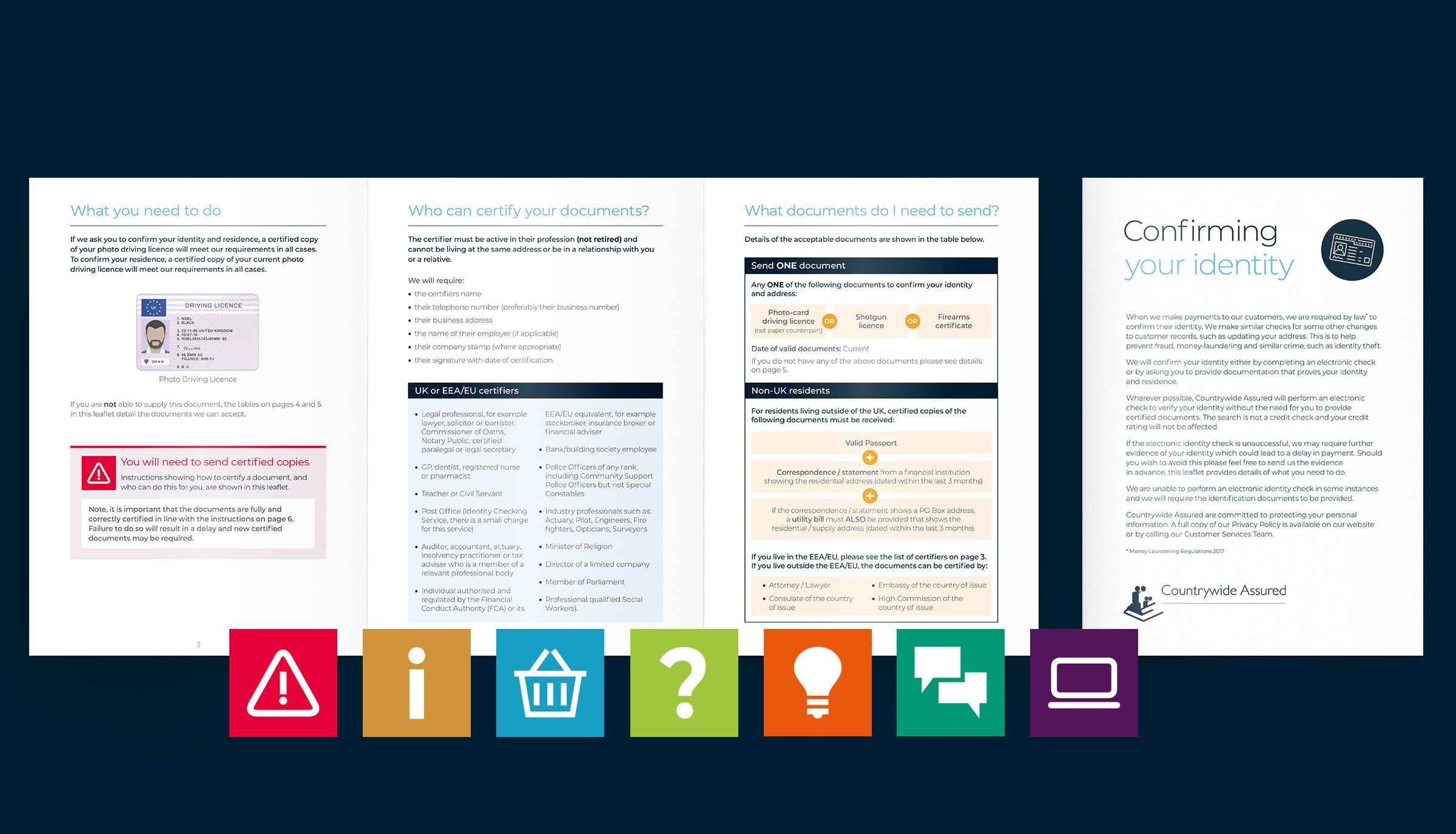
When dealing with things like bereavement and critical illness, customers are under emotional strain and the last thing they need are policy documents that are frustrating to understand. So our challenge is always to present information clearly and concisely, avoiding lengthy pages of small, densely packed text.
As creative designers it is always a dream to have access to wonderful photography and create punchy graphics to help make a design really leap off the page and say ‘buy me now!’ But Countrywide is not marketing to anyone – they are communicating important information to customers who have already bought a product. So photography is the least important element.
A brand style already existed and our ongoing role is to update and improve the design of existing content as well as create new collateral within the brand guidelines.
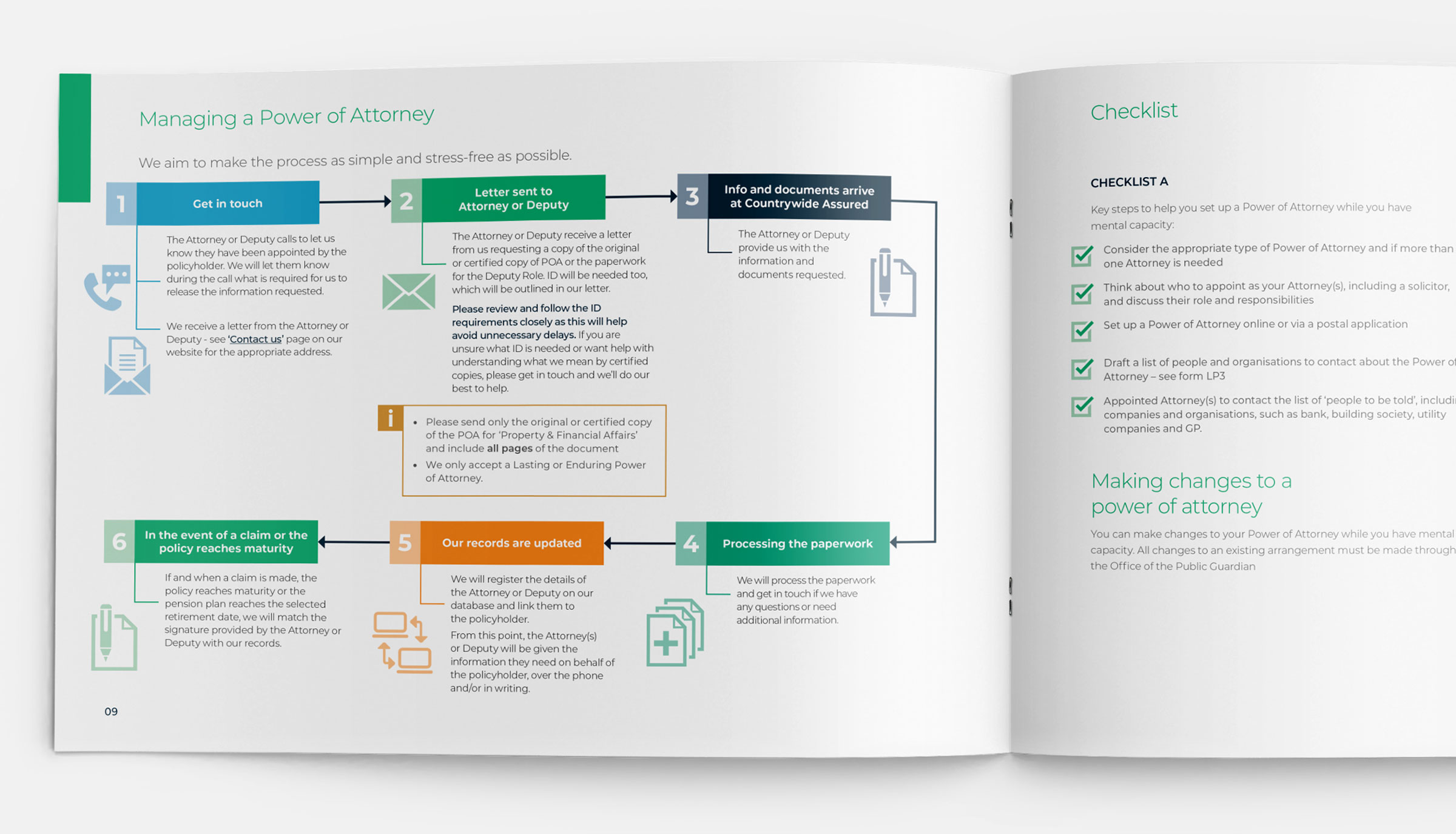
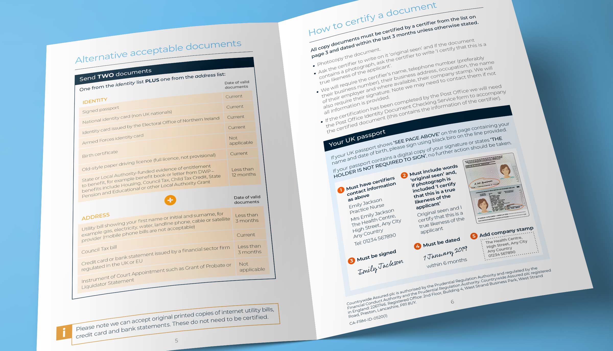
It is our job to spot a sentence that may be explained more clearly using a graphic, chart or table. We also highlight important points with colour, create small well spaced bitesize chunks of copy with clear headings and utilise recognised icons wherever possible.


