Why good looking branded imagery wins hearts (and customers)
I judge on appearance and you do too!
I recently had new business meeting with a man we’ll call Owen. He wore jeans, a shirt, a plain navy Ralph Lauren sweater – fine but not flashy and perfect for informal business. On the hand I shook, he had a pretty swish silver watch that suggested some taste and success. I’m not easily impressed by finery, but allied with good shoes, a genuine smile and a confident introduction, he exuded some professional class. My first impression I’d already decided, was of a man that appears to move through the world with a degree of ability and some success.
Imagine Owen was a brand and before he could tell anyone what he’s is about, they’d already decided it. Now imagine they really didn’t like the cut of his jib and were brutal enough to eye him up and down and walk away before he could say hello. Welcome to the fickle world of the web.
The power of first impressions
Judgment is made within milliseconds as the human brain “thin-slices” bits of information (like a person’s appearance or a website homepage) to make broad assumptions. ‘If it looks good, it must be!’ These quick judgments are sticky – that is, first impressions are lasting impressions! That initial moment is disproportionately important in shaping long-term perception, (‘confirmation bias’ in psychological terms).
With over 90% of information transmitted to the brain being visual, right or wrongly, people judge appearance first! Before falling profoundly in love with a brand’s personality, we’re superficial enough to gawp at its colour, ogle the imagery and titillating type.
In real life, a bad first impression can still earn a few polite minutes of our time. Online, people are brutal and will leave a website in the blink of an eye. Research states that it takes only 1/20th of a second for viewers to form their impression of a website. In the snap of the fingers they might be away, never to return and never mind that you had so many great things to say! In only 15 critical seconds viewers decide to stay or go, but if a website can hold attention for more than half a minute, there’s a good chance they’ll be staying longer. Then what?
Well, then you’d better have a bloody good-looking website because based on its design alone, the large majority of users (75%) will form an opinion about your entire company credibility. That is scary, but it’s also an opportunity because when a brand has a great look, people often assume the product/service itself is better – even without evidence. That’s a cognitive bias called the ‘halo effect’, like seeing a “halo” around someone due to a positive first impression, which colours perception of everything else about them.
It’s not enough just to have a website, every company has one! For it to be of any use whatsoever, you’ll need to create an impression good enough that people stay – credible enough that people trust – and special enough that your brand is the choice above all others.

The visual advantage: standing out and standing apart
Great website design is broad topic that we discuss elsewhere. For the purpose of this article, let’s consider the aesthetic appeal and in particular the use of imagery.
They say ‘a picture paints a thousand words‘ and that’s a maxim deep rooted in psychology. Not only do people process visuals faster, but also more emotionally than text! Pictures can hit quick and hard, right in the gut/heart to trigger emotions (well, tap into the limbic system to be more anatomically accurate). To know that a website has limited time to make a good impression and also accept that images can communicate quickly, intuitively and often more powerfully than language alone – then it stands to reason that we should never employ imagery simply as filler, decoration or with hapless abandon – but instead use image purposely to create the best brand impression!
The fact that people remember 80% of what they see, but only 20% of what they read, is another compelling case for caring about good design and giving utmost consideration to the images on your website.
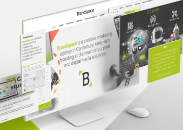
At Brandspace, we believe if possible, a company should invest in tailoring imagery unique to its brand, mission and target audience. This not only sets it apart from competitors but also strengthens recognition and connection. The opposite of unique, is generic and for a bad website the cheap and lazy choice is to bung in any vaguely relevant stock photo – the most generic imagery of all. Not that we’re above using stock, we use it all the time, but never as at comes. It is impossible for good brand designers not to want to modify imagery in some way that makes it a better fit – especially when every aspect can be edited, like colour, crop and tone, or montaging the image – anything that makes it exclusive to its brand! See an example website below in which we used stock, but changed colour and added distinct brand elements.

What kind of bespoke imagery should a brand use?
For example, an organic yoghurt brand might use hand-drawn illustrations, with warm earth tones and handwritten fonts – and the resulting artisanal, wholesome look leads consumers to believe this yogurt is more natural, healthier and made with more care than all others. A sport fashion brand may use striking, contrasty black and white images of sweating, athletic people achieving physical mastery, and we buy the training shoes because they make legends!
Every brand is different in it’s personality and needs, but all images broadly serve the purpose of creating/reinforcing brand identity; fostering emotional connection; showcasing services and products; or simply images that have an informational function.
Stock photography is a budget option, but as discussed, Brandspace strongly recommends a personalised approach. Hiring a photographer can prove a great investment, but if your budget doesn’t allow, we’ve found company specific images, even shot on iPhone (or similar), can often provide better, more relevant images than generic unrelatable stock.
AI image generation is still in it’s infancy and has a style that may fit, certainly if you need an image of a cat in superhero costume or to deepfake the president. The skill is in the prompting. We’ve found little use for it yet, but it’s evolving along with the robots and it’s gotten Vogue in a bit of bother recently
Another option Brandspace offers is the creation of templates, set up in Canva for example, with all the brand fonts and colours, allowing in-house marketing to generate their own social media posts.


If you look through our website, particulary the blog, you’ll see featured images created in our style; images that are a little creative, interesting, conceptual, or simply functional and often with a dash of wit – all the things aim to be. In short, the images are very Brandspace.
In conclusion – why good looking branded imagery wins hearts (and customers)
At Brandspace we’re not just creators of brand but consumers too. When I see a website and brand that has been lazy in their efforts, I’ll often judge harshly and not just because it’s our specialty, or that we overvalue design. It’s a human thing and some of it unconscious bias, but when a brand is seen to invest in good-quality design, confidence is felt that they’re serious about what they offer. Effort and commitment to presentation is recognised and appreciated. It’s why in marriage proposals, the ring comes in a nice box and not a jiffy bag. Quality-driven brands will make the effort!
An attractive brand (like an attractive person) can wow you with a magnetic first impression, then keep you engaged with depth and authenticity. Just as a charismatic person might have a signature style, a memorable voice, and great presence, an appealing brand stands out with consistent visuals, a clear message, and a personality that you like. You’re not just drawn to how they look, but how they make you feel. Like a truly magnetic person, an attractive brand builds rapport over time, proving reliability and a sense of belonging that turns interest into devotion.
In the world of brands, not a single one was born charming or successful, only ever created to be. Fashioning a good looking brand is something Brandspace can help with. If you’re in any doubt about your website and imagery, please call us for a chat about we might help.
To quickly gauge if a your brand’s images are effective, can you answer yes to any (not all) of these?
- Do they serve a purpose and make best use of the space? Do these images reflect what our brand does or stands for in any way?
- Would someone unfamiliar with our company get a hint of what we offer just by looking at these visuals?
- Have we been lazy in our image choice in using generic images that could belong anywhere?
- Would our ideal customer find these images appealing, relatable, informative or even inspiring?
- Are the images consistently styled across our website and other platforms (e.g., subject, colour, tone, quality)?
- If we removed the logo, would someone still recognise this as our brand?
- Are they of a quality that befits our brand? Could we do better?
- Am I a UK based company but clearly using American stock photo, as no group of people here could collectively smile that broadly with as many white and shiny perfect teeth?

Call us and see if we can’t help make your brand and website the one to fall in love with above all others. info@brandspacemedia.co.uk or call 01227 478605.