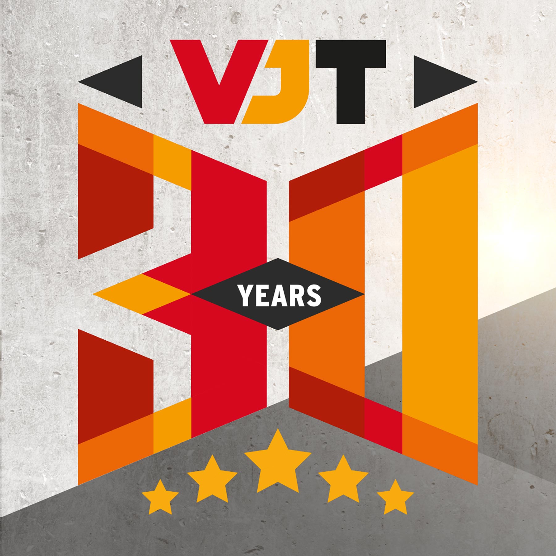
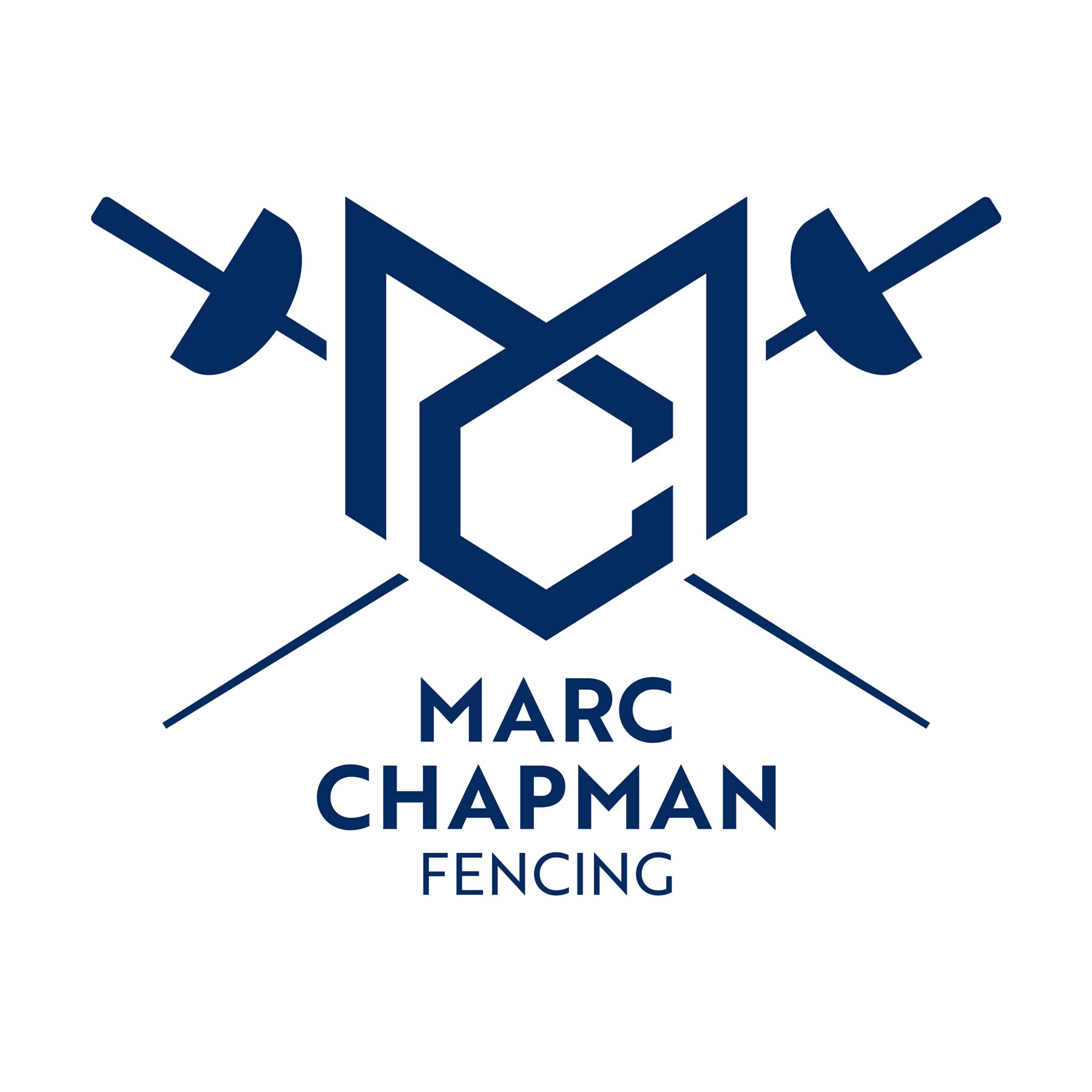
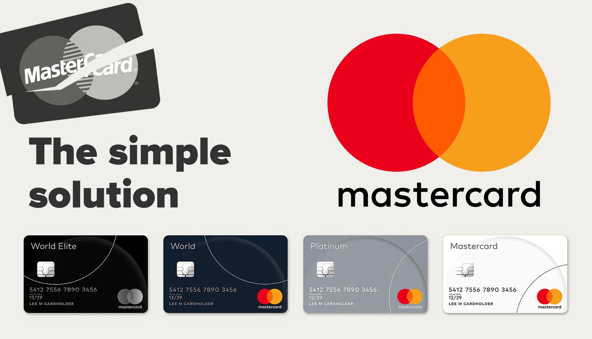
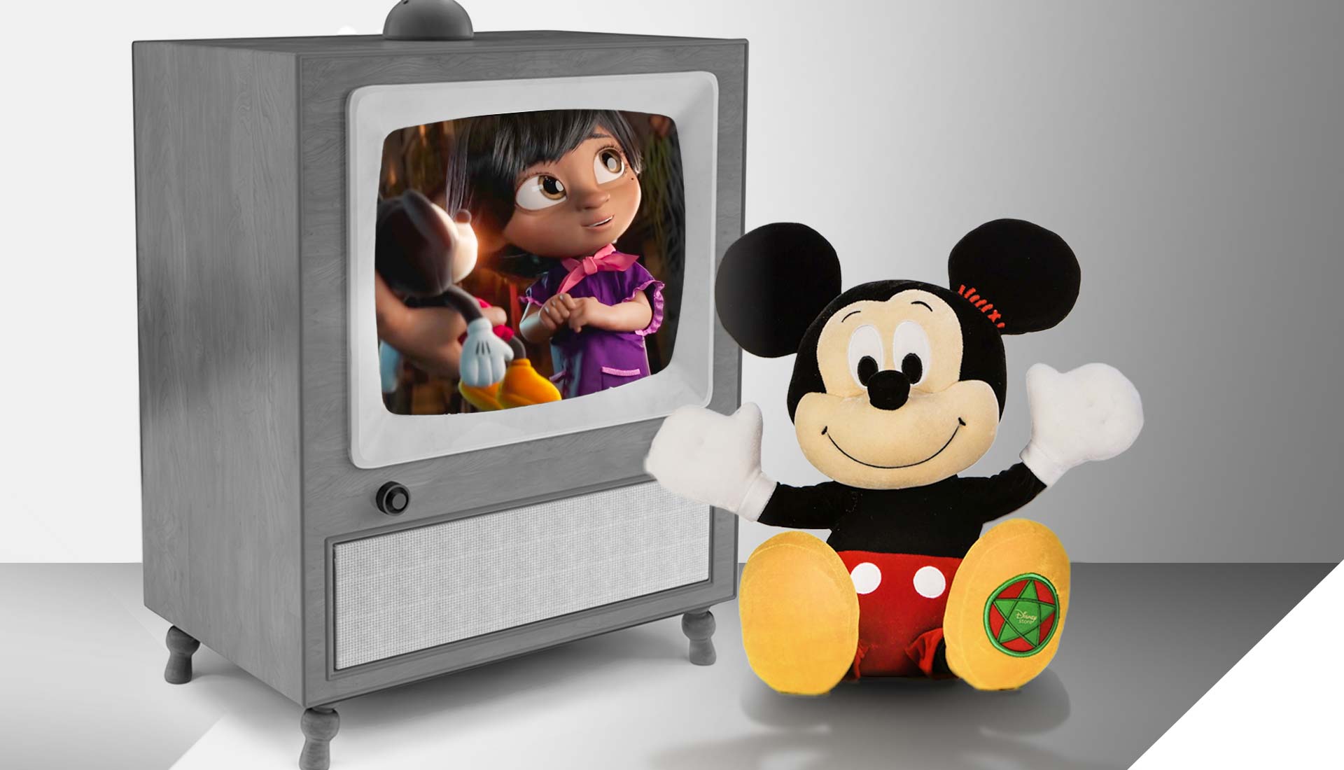
Brandspace has vast experience in designing and redesigning logos.
Creating a strong logo requires a combination of design expertise, a deep understanding of the brand’s identity, and the ability to distil complex ideas into a simple, visually appealing form. When these elements come together harmoniously, a logo becomes not just a graphic but a powerful symbol that represents the heart and soul of a brand.
Brand new logo
Designing a logo from scratch begins with a blank canvas and a vision. Research into the brand history and story, target audience, industry trends, and the values and personality of the organisation being represented are required.
With a combination of colours, typography, and symbols, the logo takes shape. Once we have options that best distil the embodiment of the brand identity, our designed logos are presented, and client feedback is requested. Through iterative processes, we refine the logo until it is final.
Refreshing an old logo
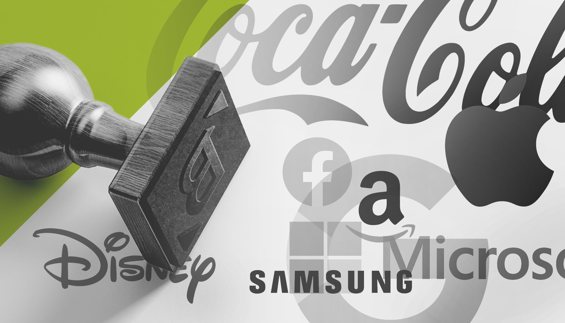
Brandspace has extensive expertise in reworking logos to improve them. There have been occasions where clients wanted to change their logo but to do so completely would have been the wrong thing to do, losing the brand equity. Logos don’t always have to undergo dramatic changes but some subtle ones can help to retain invaluable brand familiarity while optimising the logo for better use, maybe as part of a brand refresh, or to make it work in today’s digital world.
Considerations that make great logos
1. Simple and Memorable
A stand-out logo is uncomplicated and easy to recognise. It should be instantly comprehensible, even at a glance, and not cluttered with unnecessary details. A successful logo is memorable and sticks in people’s minds. This memorability is often achieved through a combination of simple shapes, balanced design, and unique visual elements. Ultimately, a logo should evoke positive feelings and impressions about the brand and resonate with the target audience, fostering a sense of trust and connection.
2. Versatility and Scalability
A strong logo works across various applications and mediums, from business cards and websites to billboards and social media profiles. It should maintain its integrity whether displayed in large or small sizes, in colour or monotone. This requires careful consideration of how the logo’s design will adapt to different sizes. Logos should be designed with flexibility in mind, allowing for variations and adaptations for different applications while maintaining the core visual identity.
3. Uniqueness and Timelessness
An effective logo is distinctive and sets the brand apart from competitors. It avoids similarities to other logos, preventing confusion and making a lasting impression. While trends come and go, a great logo stands the test of time. Avoiding overly trendy elements can ensure the logo remains relevant and effective for years to come.
4. Brand aesthetics
Colours evoke emotions and associations and the right colour palette can enhance the logo’s impact and make it more relatable to the brand’s identity. If the logo includes text, the choice of typeface is crucial. The typography should be legible and align with the overall brand personality. Symbols or icons within a logo can carry subtle messages or symbolism related to the brand’s identity, values, or products/services. A well-designed logo maintains a harmonious balance between its elements, ensuring that no one part overpowers the others. Proportions play a crucial role in achieving this balance.
5. Consistently applied
It is key that a logo is consistently used across all brand materials and touchpoints to ensure brand recognition and strengthen the logo’s association with the brand.
More insight from our blogs…
Let’s meet up
It starts with an introductory meeting – You can just ask for some one-off advice, or you can engage our services on an hourly rate, project fee or retainer basis – we are totally flexible to your needs. Get in touch by phone or email, or complete the enquiry form.
