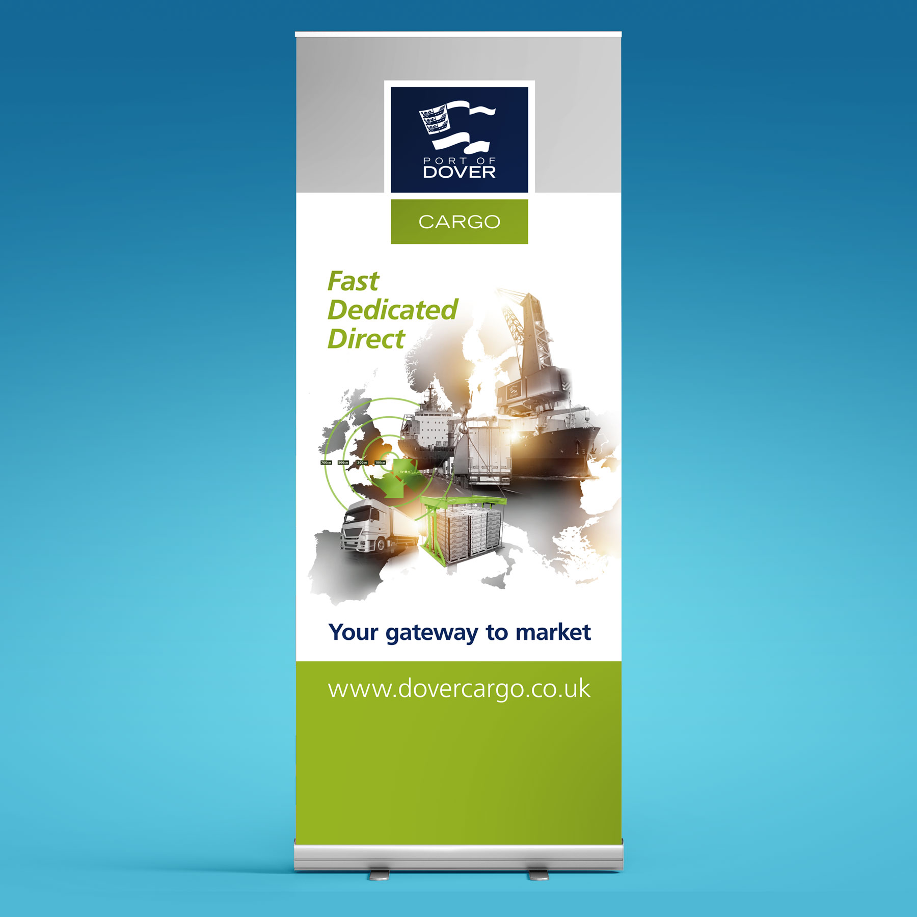
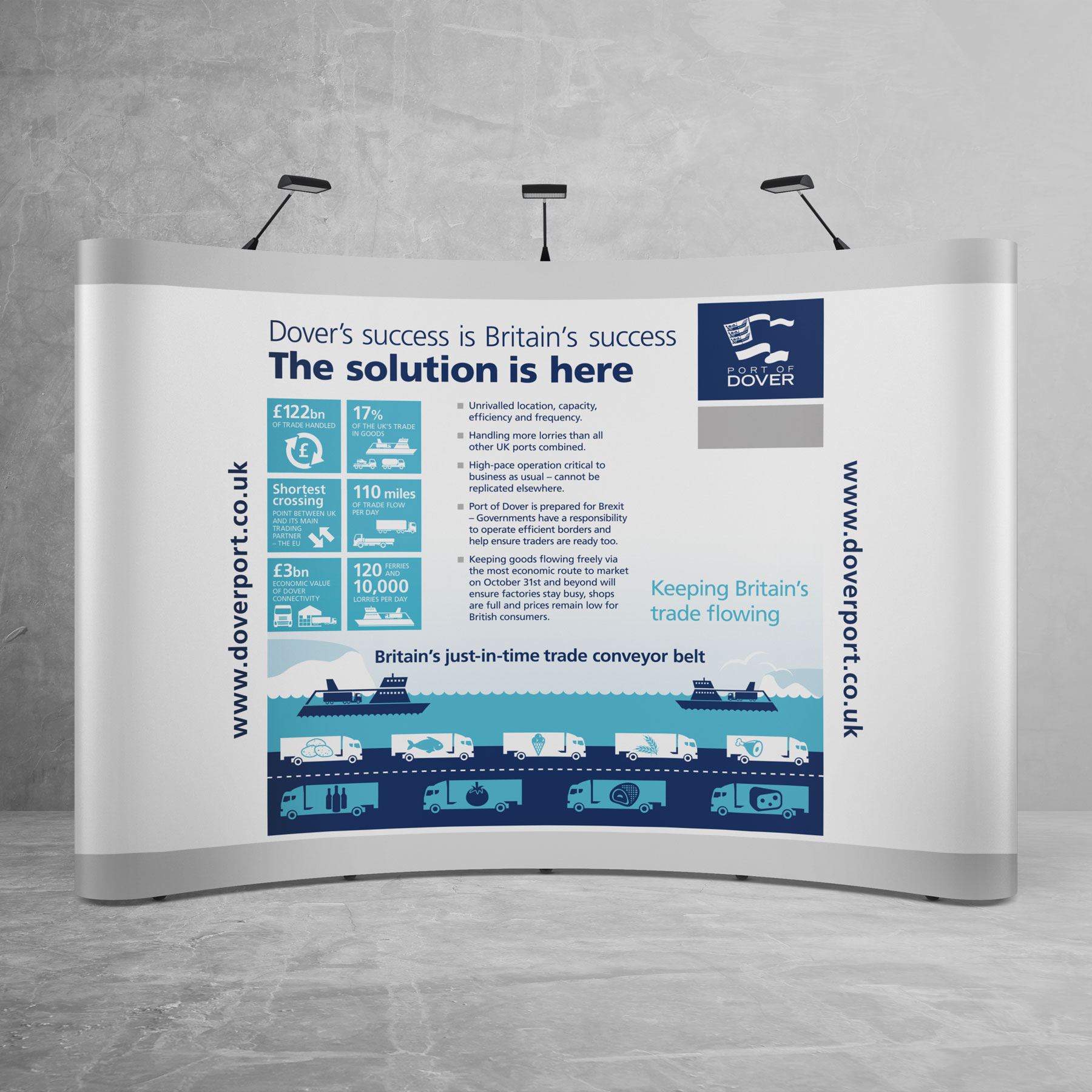
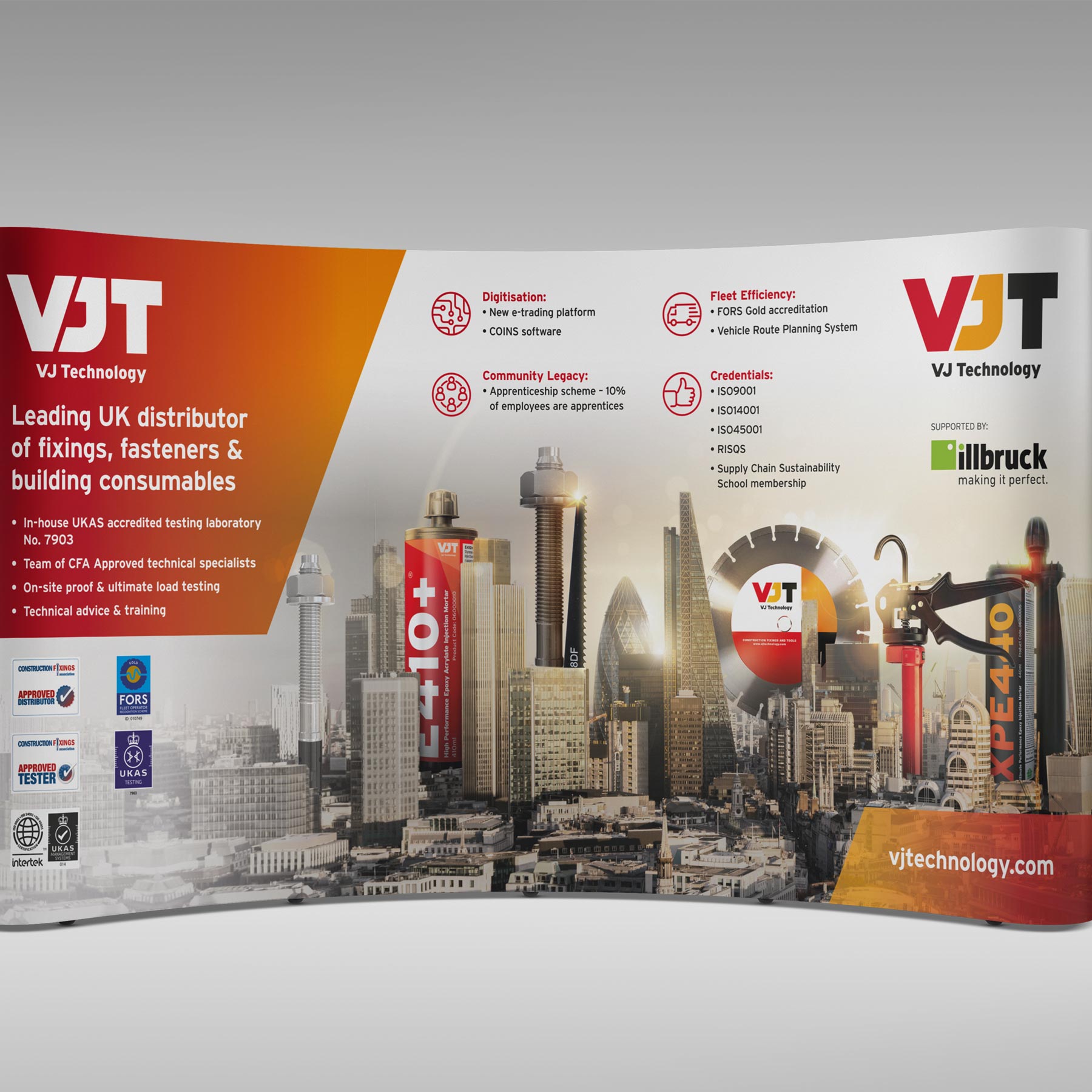
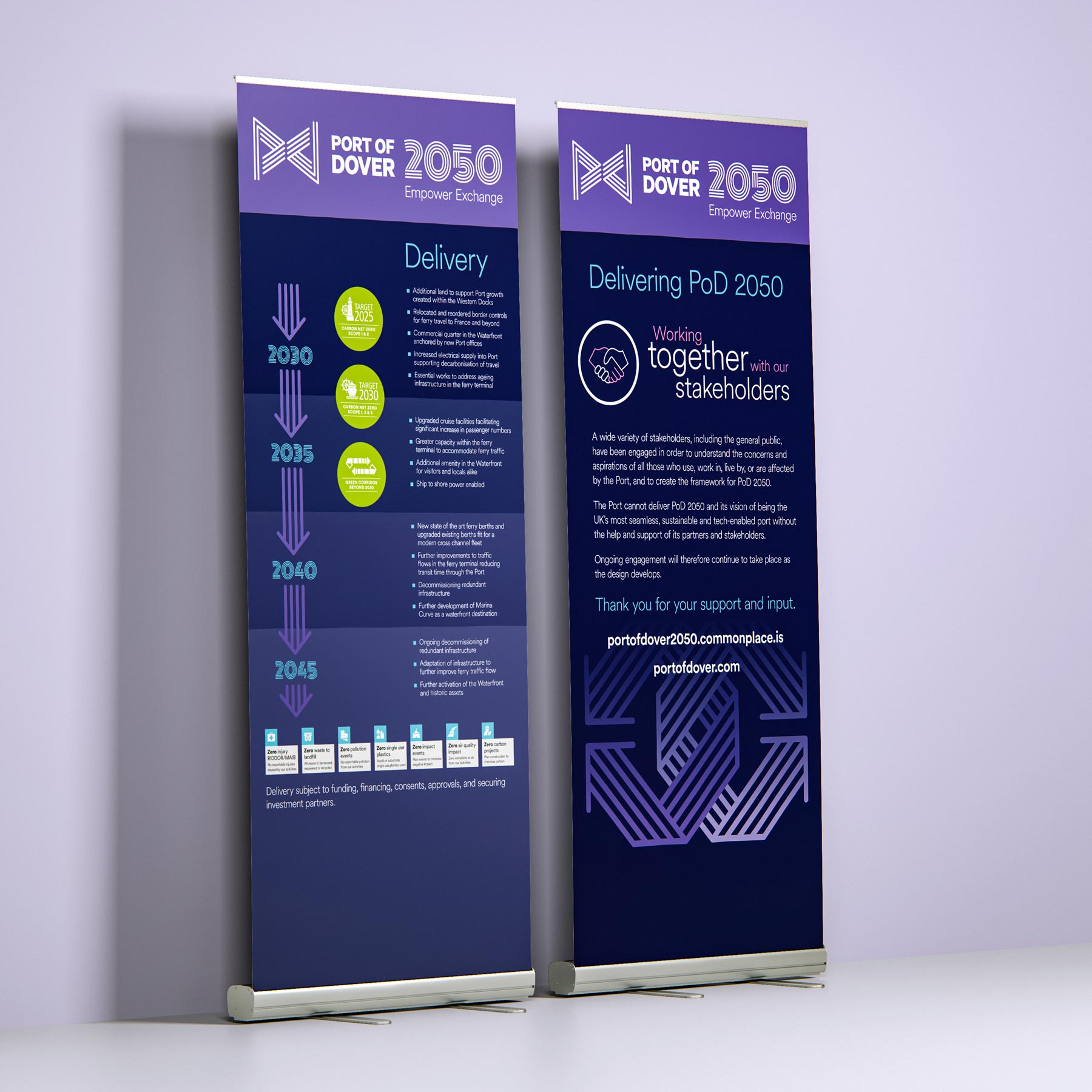
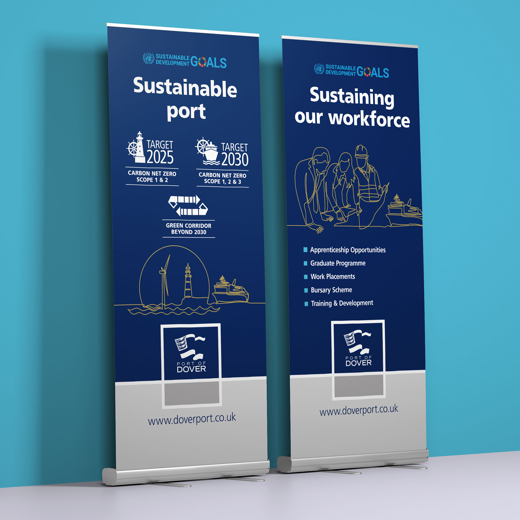
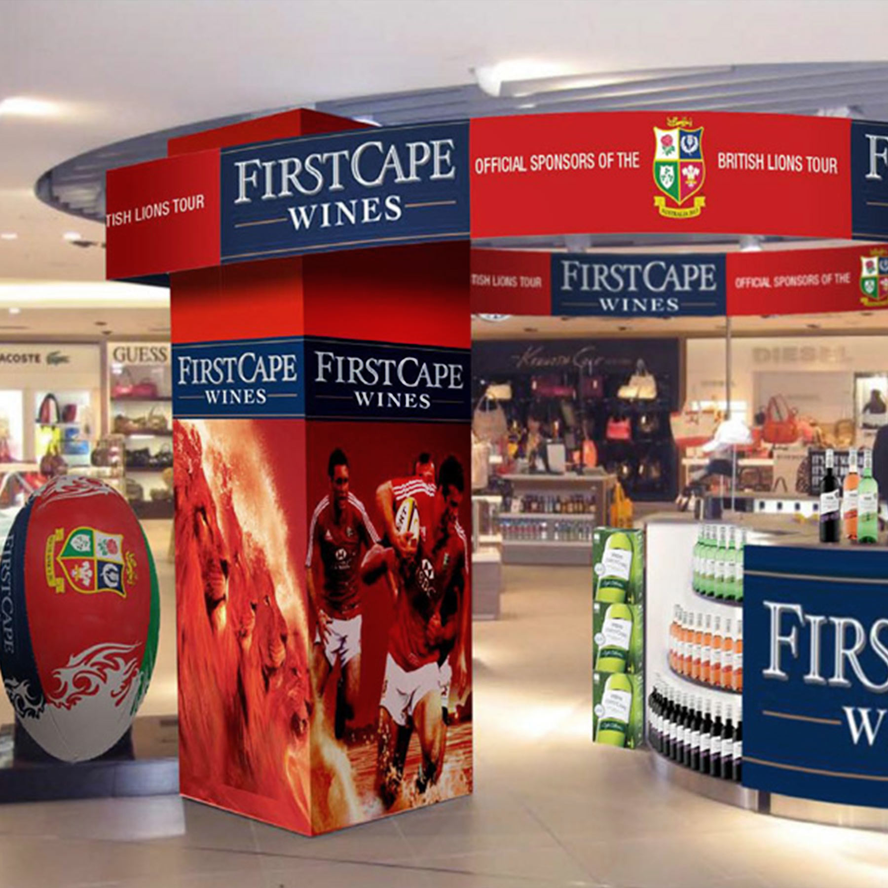
Eye-catching Exhibition Stands
Brandspace design considerations for effective exhibition graphics
1. First impressions are lasting impressions
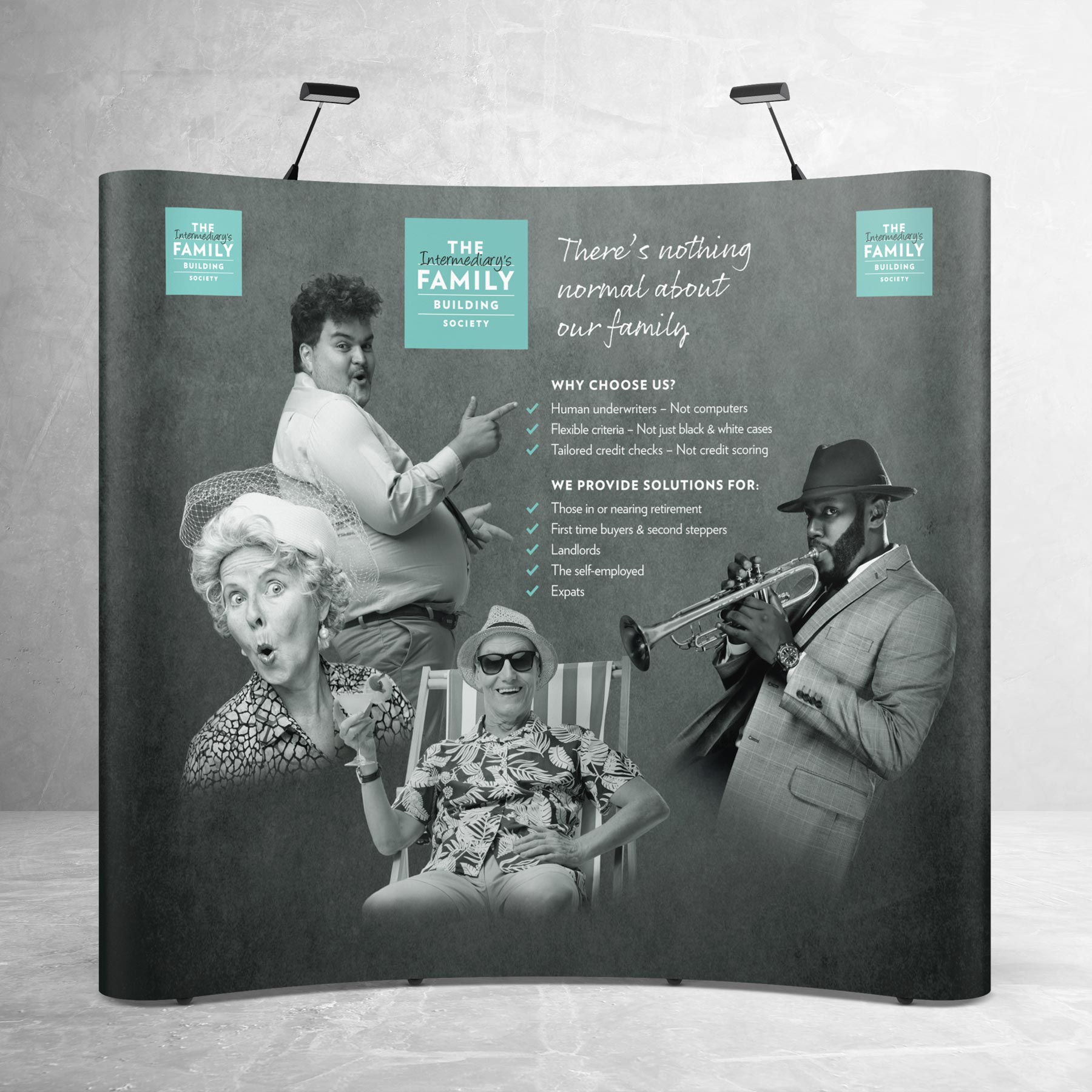
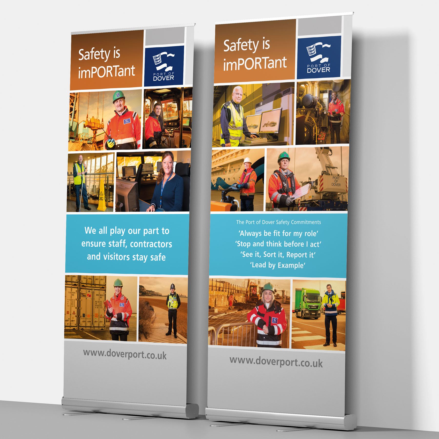
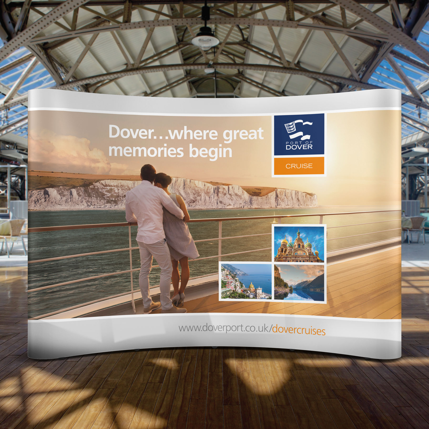
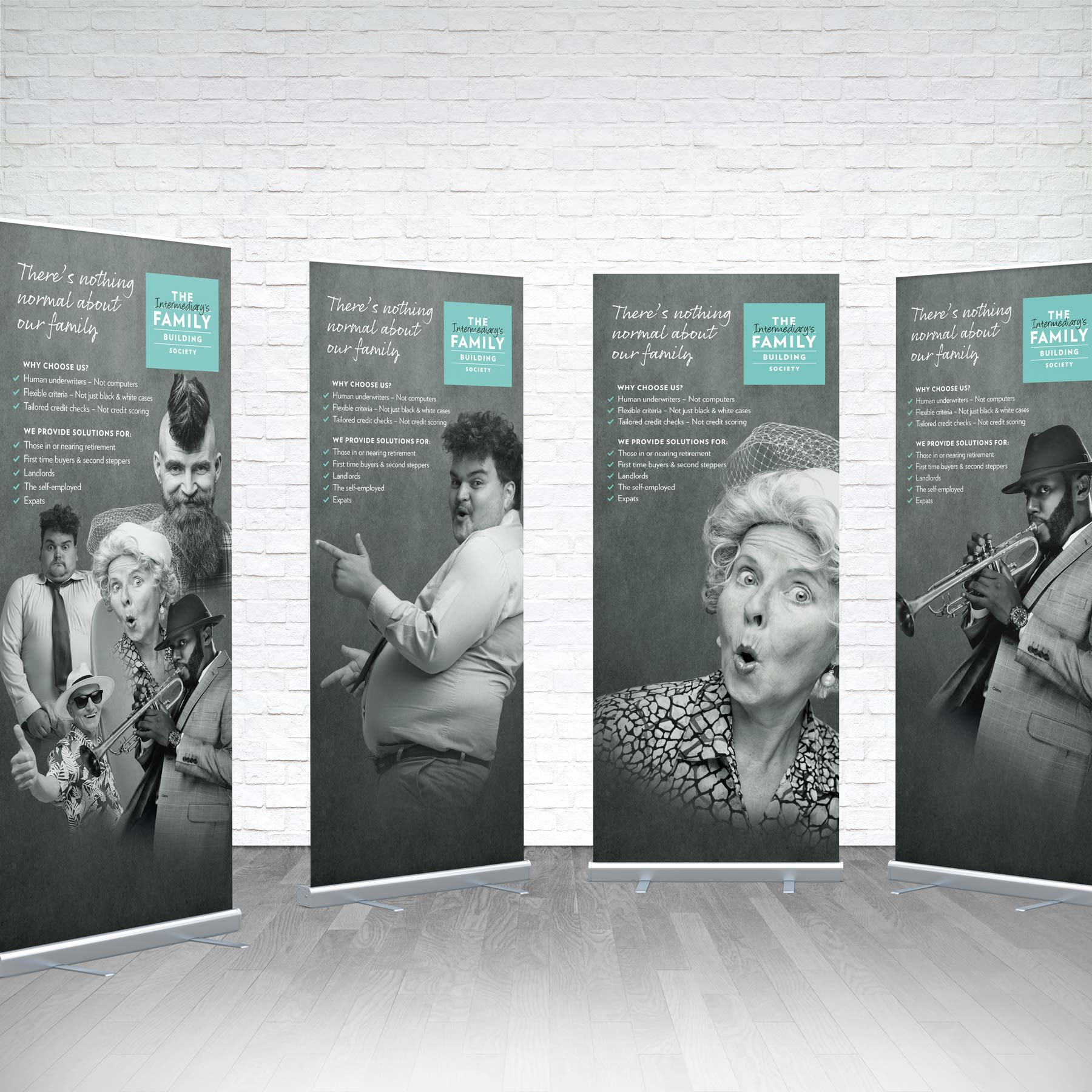
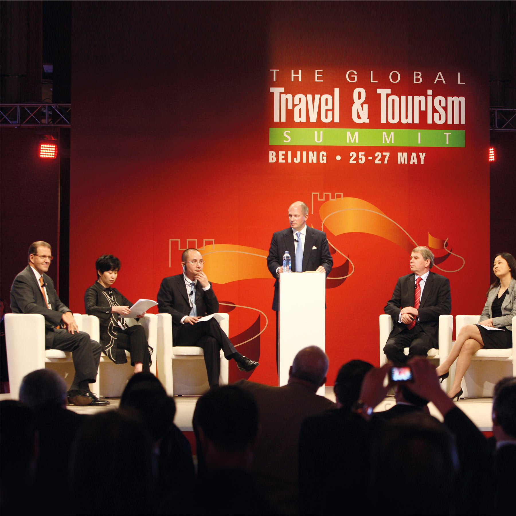
Invest in the very best exhibition design to stand out. People judge quickly, they’ll walk by or stop and engage depending on their feeling about what they’re seeing! Impactful design is the arresting power behind the messages and the sales force. Exhibition graphics allow for imagery at a compelling scale – use this to make them heroic and uniquely yours.
2. Brand it
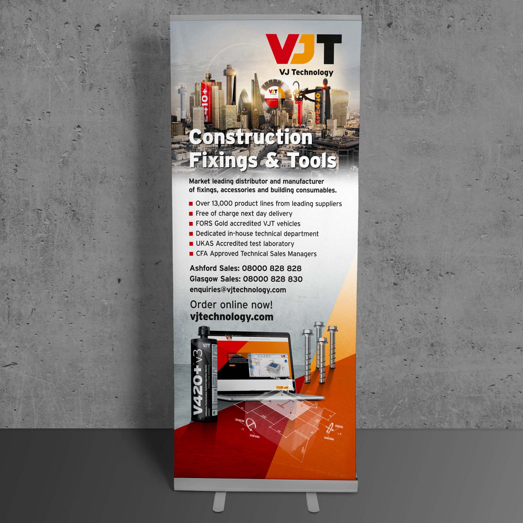
A brand serves a company when it is recognised. It’s good practice to display a company logo at the top of your stand. Colour too is really important to distinguish a company. Brand recognition is increased by 80% when using a signature colour.
3. Best not overcomplicate things
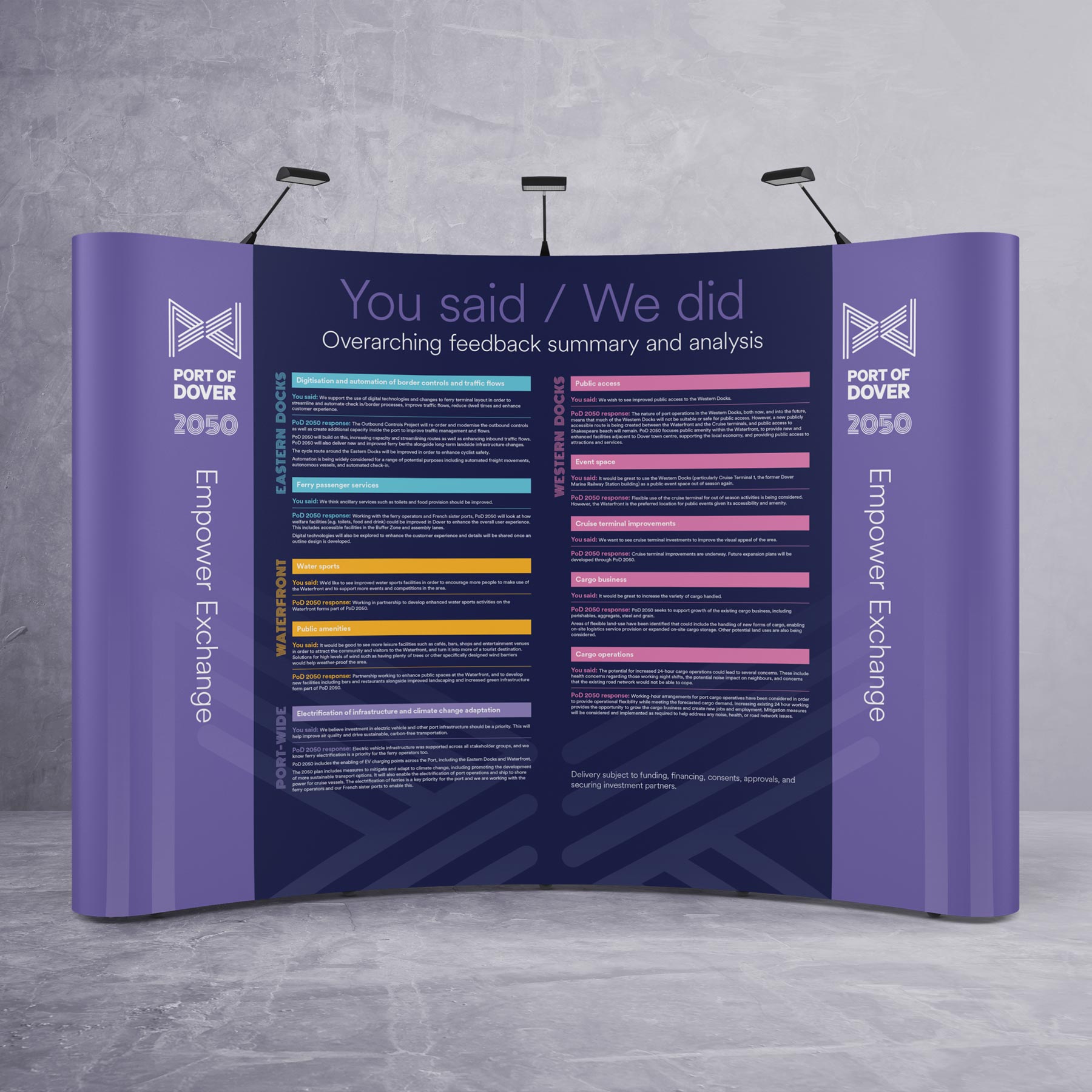
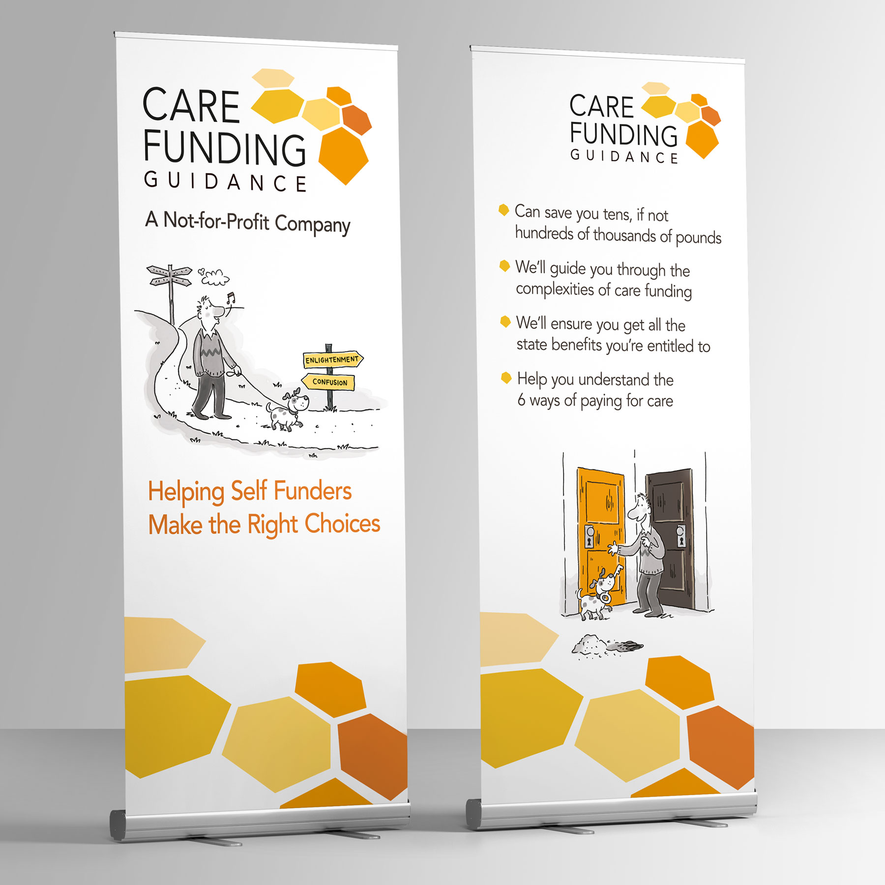
People get sore necks and feet that shuffle off in boredom if presented with a long read that stretches to both ends of their peripheral. For the most important messaging make it large and eye level. After that keeping words to a minimum with bullet-pointed content and infographics all help communication to be compelling. More can be provided by your sales team or supporting collateral.
4. Call to action
Some banners may simply convey a message or nicely brand a lobby, but if you want people to follow up or look further, let them know-how with web addresses, contact detail and socials.
Contact the Brandspace Media team to make your business stand out from the crowd at your next event: 01227 478605
